As someone with an interest in design (I’m not sure I’ve earned the right to call myself a “designer” just yet), I find it interesting to compare design in different fields and different cultures. Some of the same principles that apply to designing a subway map might very well apply to web design, and what’s more two different cultures usually have different approaches for both of these tasks.
This was very apparent during my recent trip to Japan. The Japanese do a lot of things differently from Europeans, and I thought it would be interesting to consider those differences form a designer’s point of view.
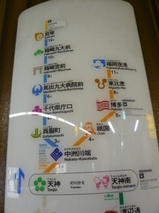
This subway map uses icons to symbolize each stop. This makes it easier to remember where you’re supposed to get off, while at the same time telling you at a glance the main attraction for this area.
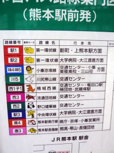
This bus timetable uses animal icons for each bus line. In Japan, kids start going to school alone very early, so this helps them take the right bus. It’s easier to remember “take the panda bus and then change for the tiger bus” than “take bus 206 then bus 43″.
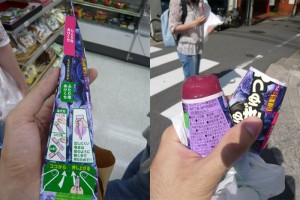
When was the last time you needed operating instructions to eat ice cream ? You can open this ice cream package in two separate places, so that you can either eat it alone, or break it in two to share with a friend.
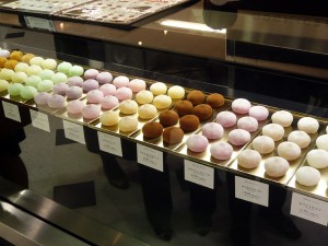
Japanese shops are famous for their beautiful displays and packaging. Even candy can be turned into a work of art. Never mind what it tastes like, you want to buy some just because it’s so pretty.
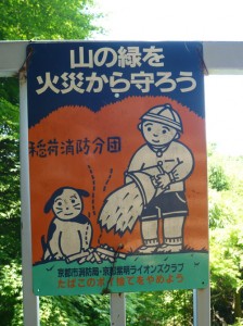
In Japan, cartoons are used for anything, anywhere. For some reason they are always cute and often include a dog, cat, or panda, even when the subject matter is serious (here, fire safety).
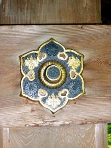
One of the traditional characteristics of japanese design is attention to detail. In most temples, even the bolts holding the beam together are beautifully decorated. Some temples can get quite large, and it was common for thousands of identical bolts to be hand made.
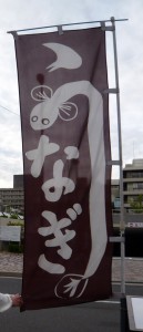
Finally, a bit of typographic amusement: in this banner for an eel (unagi) restaurant, part of the “u” character has been replaced by an eel. Hiragana and katakana characters are simpler than kanji (chinese characters) and lend themselves well to typographic experiments and play.
hey
love the site keep up the good work!
Nice article. the images between your posts help to better understand and illustrate the post. keep it up.
I love your Design Resources site. I use it all the time.
Have you seen heathrowe.com? It has a lot of great resources, links, tutorials, etc. that might make a great addition to your list.
Thanks for your comment !
That site looks interesting, I’ve added it to the search engine.
when i go to a gift shop, i always look for cute little stuffed animals and other cute stuffs-..