

It’s not often that you get an opportunity to work for a brand like Le Monde, and especially on such a project. At a time where the news industry is trying to reinvent itself, I was hired to design the newspaper’s new iPhone/iPad application [iTunes link].
Although I worked on both platforms, I will focus here on the iPad part of the app, since it has more features.
Disclaimer: the following images are photoshop mockups, not actual application screenshots. But they are still fairly representative of the finished product, which you can check out on iTunes.
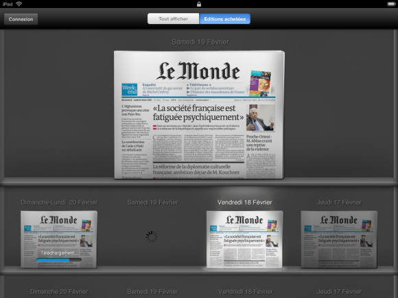
Although my worked needed to follow existing brand guidelines, I was left fairly free to design the overall look how I wanted to. I chose to move away from bright Web 2.0 colors and use a dark theme to give the interface a serious feel while using the strong contrast to put the newspaper’s white page forward.
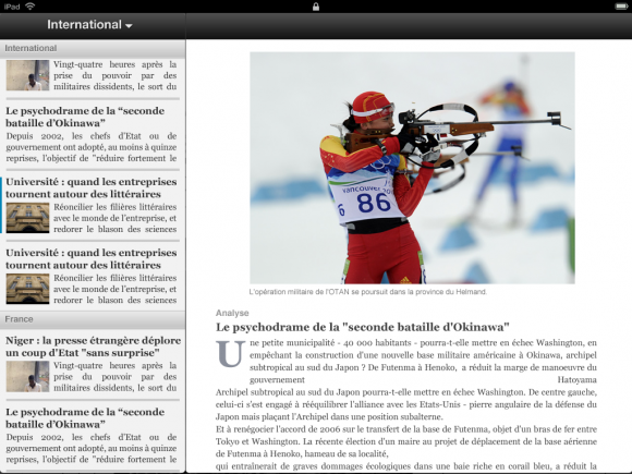
One of the challenges at the time was designing for the iPad, a platform that nobody had ever seen or used. After watching the keynote a dozen time and going through every article I could find on the subject, I decided to pick up a few of the new iPad UI elements such as the bookshelf metaphor or the split view.
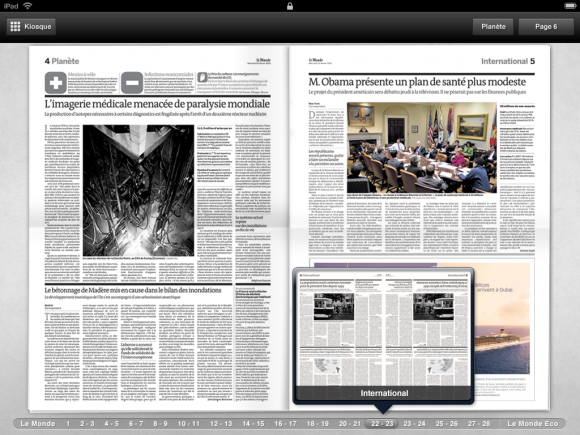
I also came up with new ways to use the iPad’s larger screen, such as pop-overs for navigating within a page, and previewing other pages.
I just wish I could’ve exercised more control on the finished product, and taken more time to polish the application. As is usually the case when working for large and complex organisations, there were a lot of external pressures, but altogether this was a great experience, and I have no doubt that the iPad is leading a revolution in the way we use and relate to computers.