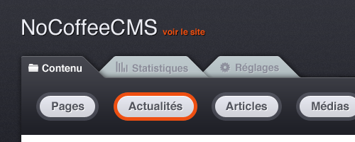
When Didier first approached me to work on a user interface for Locomotive, his content management system (at the time still called NoCoffeeCMS), I thought it was a great opportunity to finally design my ideal CMS interface. I’ve worked with Joomla, WordPress, Textpattern, and Expression Engine, and none of them had that perfect mix of features, flexibility, and good design (although WordPress and Expression Engine came pretty close). I was inspired by the tabs of The Hit List, a Mac to-do app, and quickly came up with a first mockup, which ended up being pretty close to the final product.
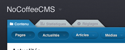
We tweaked the colors and buttons some more, and came up with the idea of assigning a different color to each tab.
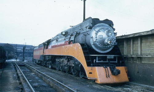
Around that time, we also came up with the name “Locomotive”. We liked how it related to the Rails world, and evokes something powerful enough to pull a lot of weight. I remember how I used to play Railroad Tycoon (now renamed Railroads) as a kid, and went looking for locomotive inspiration. The Golden State Locomotive was a perfect mascot: sleek, powerful, and has a beautiful retro art-deco feel.
Since I can’t draw anything more complex than a modal pop-up, the very talented Emmanuel Grard did the actual vector rendering of the locomotive.
For the front-end site, we knew that we wanted something that matched the back-end’s colors and style. But I went too far in trying to keep things simple, and the result looked uninspired and dry.
Thankfully Didier wasn’t afraid to call me out on it and push me harder, and so the second version was completely different, and much more promising.
But something was still missing. The design felt flat and lacking impact, and more importantly my girlfriend didn’t like it (Dribbble might be nice, but no one beats girlfriends when it comes to giving out criticism)
It was also clear that the site didn’t evoke the Ruby universe enough. It was time for a bold move.
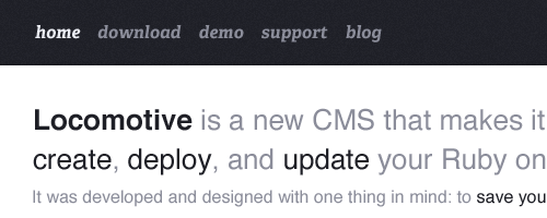
Applying a single gradient turned out to make a huge difference, and all the other elements started falling into place. A few tweaks later, Locomotive’s home page was finally good to go.
By the way, you might have noticed that the site doesn’t have any navigation. I liked the idea of the homepage being self-contained. I think it encourages people to scroll down the page, while reassuring them that they won’t need to browse through dozens of pages to find the info they need.
So there you go. I encourage you to give Locomotive a try, and await your feedback on the design and general user experience.
[…] After designing the user interface for Locomotive (a Ruby on Rails CMS), I did the front-end site. You can read more about the design process in the blog. […]
All I can say is continue. Some professional bloggers post couple of times a day on their blogs, simply because this regular addition of new content helps those to get regular readers.
Nice design and I agree that EE and WP are the closest to a nice UX within a CMS.
Impressive work. Further, really like the CMS inside.
But why not using CSS-only button? It will be more awesome.
Thanks for your comment. I didn’t code the site myself, so I don’t really know!
Great work. Your portfolio is awesome. You have great aesthetic sense. Congrats
Thanks!