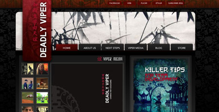
My first reaction when seeing this site was “wow !”. My second reaction was “huh ?”. Let me explain.

You can’t deny this site’s design is beautiful. It’s one of the best uses of the oriental theme I’ve seen (after my own site, of course !). But look closer. See those little funny signs near the title ? Believe it or not, a long, long time ago, in a galaxy far, far away, those were actually words ! With their own meaning ! Who would’ve guessed, huh ? Apparently not this site’s designers, because as far as I can tell, here the chinese characters don’t mean anything.
I was willing to give them the benefit of doubt for the title, because after all it could be some obscure ancient chinese proverb that I’m not good enough to decypher. But look at how they use individual characters as bullet images for each section.
The character before each blog post means “add”. The one near the recent comments is “study”. The one by “viper media” means “friendship”, and the one next to the newsletter is “west”.
Now I don’t want to sound all high and mighty, but the point of good design is not just to look pretty. Elements should have some kind of semantic value, too. My point is: don’t use something just because it looks pretty, especially if it has a meaning in another language or situation.
Or at least if you want to use chinese characters just cause they look nice, make sure you use obscure non simplified characters, not basic words that you learn after one hour of chinese classes…
That realy seems stupid, the designer certainly doesn’t know that it was Chinese characters. Or maybe now the meaning is not so important to do jumps. Where is your brain ?
very interesting, but I don’t agree with you
Idetrorce